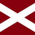
Sertse Posted June 10, 2022 Author Share Posted June 10, 2022 Long sleeve is very smart, I take back what I said Quote Link to comment Share on other sites More sharing options...
Stu_HMFC Posted June 10, 2022 Share Posted June 10, 2022 That goalkeeper top 😂 Quote Link to comment Share on other sites More sharing options...
Homme Posted June 10, 2022 Share Posted June 10, 2022 It's fine if a little bland. Quote Link to comment Share on other sites More sharing options...
Stu_HMFC Posted June 10, 2022 Share Posted June 10, 2022 Already seen someone moaning on twitter about the Umbro logo being maroon and not gold but on the infant kit it’s gold 😂😂 Quote Link to comment Share on other sites More sharing options...
Sertse Posted June 10, 2022 Author Share Posted June 10, 2022 And the short sleeved Quote Link to comment Share on other sites More sharing options...
Jack Torrance Posted June 10, 2022 Share Posted June 10, 2022 Very similar to 2012 which was my favourite. Love this. Quote Link to comment Share on other sites More sharing options...
Newton51 Posted June 10, 2022 Share Posted June 10, 2022 Very smart. Much nicer than last season Quote Link to comment Share on other sites More sharing options...
Italian Lambretta Posted June 10, 2022 Share Posted June 10, 2022 Same as 2012 that must have took all of 5 minutes to design 😑 Quote Link to comment Share on other sites More sharing options...
Sertse Posted June 10, 2022 Author Share Posted June 10, 2022 When's our all pink number coming? Quote Link to comment Share on other sites More sharing options...
PapaShango Posted June 10, 2022 Share Posted June 10, 2022 I like it, less white and more maroon on the home top is always good IMO. Quote Link to comment Share on other sites More sharing options...
Rick Sanchez Posted June 10, 2022 Share Posted June 10, 2022 4 minutes ago, Sertse said: Long sleeve is very smart, I take back what I said I've never purchased a long sleeve before but this might be the year! Quote Link to comment Share on other sites More sharing options...
Sertse Posted June 10, 2022 Author Share Posted June 10, 2022 Just now, Rick Sanchez said: I've never purchased a long sleeve before but this might be the year! Beauty isn't it. Collar looks too big on the short sleeved for my liking bit it's only been like 10 minutes and it's growing on me. Quote Link to comment Share on other sites More sharing options...
Shanks Posted June 10, 2022 Share Posted June 10, 2022 The collar ruins it for me Quote Link to comment Share on other sites More sharing options...
Sooks Posted June 10, 2022 Share Posted June 10, 2022 On 08/06/2022 at 19:19, jambo1980 said: This is the new Dynamo Dresden home by Umbro. It's apparently a custom shirt for their 70th anniversary, with the stripes on the cuff signifying 1953, but something similar could be decent when converted into our colours (though the colours here are actually pretty similar to a couple of our old away shirts). https://www.footyheadlines.com/2022/06/dynamo-dresden-22-23-home-kit-leaked.html The new Harry Potter reboot looks shite Quote Link to comment Share on other sites More sharing options...
boag1874 Posted June 10, 2022 Share Posted June 10, 2022 Love it, basically the 2012 top as others said but with a better sponsor Quote Link to comment Share on other sites More sharing options...
fast_blood Posted June 10, 2022 Share Posted June 10, 2022 3 minutes ago, Italian Lambretta said: Same as 2012 that must have took all of 5 minutes to design 😑 It was Robbie who designed it. He only had a few minutes to do it before cracking on with signing more defensive players. Quote Link to comment Share on other sites More sharing options...
Sooperstar Posted June 10, 2022 Share Posted June 10, 2022 First one I've liked for a few years. Quite a 2012 vibe about it. Need a Wonga loan to buy it at 52 quid a pop! Quote Link to comment Share on other sites More sharing options...
Sooks Posted June 10, 2022 Share Posted June 10, 2022 It is the perfect Hearts top shades of the 2012 one minus that ugly Wonga shite on it Quote Link to comment Share on other sites More sharing options...
tian447 Posted June 10, 2022 Share Posted June 10, 2022 I love it, but I'll wait for other posters to order one and moan on here about the sizes and the collar before deciding what size I need Quote Link to comment Share on other sites More sharing options...
Rockwell Posted June 10, 2022 Share Posted June 10, 2022 Really like it hopefully the collar is just a bad photo as looks stretched and out of shape Quote Link to comment Share on other sites More sharing options...
The Grim Reaper Posted June 10, 2022 Share Posted June 10, 2022 Very nice!! Quote Link to comment Share on other sites More sharing options...
Der Kaiser Posted June 10, 2022 Share Posted June 10, 2022 I'm buying it.....if only to put it in the frame beside my Cup Final Ticket. Quote Link to comment Share on other sites More sharing options...
Costanza Posted June 10, 2022 Share Posted June 10, 2022 I have the 2012 without the sponsor. No need to buy this, not that I'm of an age to buy anyway. For new and up and coming shirt buyers does look good and much better than last seasons Quote Link to comment Share on other sites More sharing options...
Bozi Posted June 10, 2022 Share Posted June 10, 2022 That goalie top looks like the start of a migrane 😂😂 Loving the home top though, defo a better version of the 2012 Quote Link to comment Share on other sites More sharing options...
Ray Gin Posted June 10, 2022 Share Posted June 10, 2022 Decent enough if a little basic. It's good that we are now consistently getting a good shade of maroon at least. Quote Link to comment Share on other sites More sharing options...
Fitzroy Pointon Posted June 10, 2022 Share Posted June 10, 2022 2012 with a better sponsor. That will do for me. Quote Link to comment Share on other sites More sharing options...
Gambo Posted June 10, 2022 Share Posted June 10, 2022 Home top looks fine. Goalie top though..... Quote Link to comment Share on other sites More sharing options...
I.T.K Posted June 10, 2022 Share Posted June 10, 2022 8 minutes ago, Sooks said: The new Harry Potter reboot looks shite Not sure... I assume the black leather sofa is just out of view? Quote Link to comment Share on other sites More sharing options...
tian447 Posted June 10, 2022 Share Posted June 10, 2022 Hearts Direct running like treacle. Looks like a lot of people having a look or buying it already. Quote Link to comment Share on other sites More sharing options...
heartandsoul Posted June 10, 2022 Share Posted June 10, 2022 Cracking top. Quote Link to comment Share on other sites More sharing options...
DG_HMFC Posted June 10, 2022 Share Posted June 10, 2022 Cracker. Absolutely love it! This will sell like hot cakes. Quote Link to comment Share on other sites More sharing options...
erskinehearts Posted June 10, 2022 Share Posted June 10, 2022 i like this! Quote Link to comment Share on other sites More sharing options...
Ray Gin Posted June 10, 2022 Share Posted June 10, 2022 13 minutes ago, Sertse said: And the short sleeved Ribbed for our pleasure. Quote Link to comment Share on other sites More sharing options...
Newton51 Posted June 10, 2022 Share Posted June 10, 2022 Think the shop website crashed Quote Link to comment Share on other sites More sharing options...
Sooks Posted June 10, 2022 Share Posted June 10, 2022 1 minute ago, I.T.K said: Not sure... I assume the black leather sofa is just out of view? 😄 Quote Link to comment Share on other sites More sharing options...
Nookie Bear Posted June 10, 2022 Share Posted June 10, 2022 I like. Nice horizontal effect. Maintained the proper maroon. Gold logo Decent. Could have done with a bit of warning before that keeper top appeared though Quote Link to comment Share on other sites More sharing options...
Bungalow Bill Posted June 10, 2022 Share Posted June 10, 2022 1 minute ago, Salad Fingers said: 2012 with a better sponsor. That will do for me. 2012 had a better collar, but 2022 is a better shade of maroon. Quote Link to comment Share on other sites More sharing options...
kingantti1874 Posted June 10, 2022 Share Posted June 10, 2022 Collar looked weird at first glance. But I like it. 2012 with a far better sponsor.. what’s not to like.. like the wee maroon block on the shorts also Quote Link to comment Share on other sites More sharing options...
Sigma One Posted June 10, 2022 Share Posted June 10, 2022 10 minutes ago, Sooks said: The new Harry Potter reboot looks shite 🤣🤣 You're a wizard footballer, Harry. Quote Link to comment Share on other sites More sharing options...
PTBCAL Posted June 10, 2022 Share Posted June 10, 2022 Belter Quote Link to comment Share on other sites More sharing options...
ShedBoy Posted June 10, 2022 Share Posted June 10, 2022 Absolutely bogging imo. Terrible collar looks really crap. Sorry Quote Link to comment Share on other sites More sharing options...
Nookie Bear Posted June 10, 2022 Share Posted June 10, 2022 And i'll just say "ooft...take my money" before a certain other poster does. Quote Link to comment Share on other sites More sharing options...
Newton51 Posted June 10, 2022 Share Posted June 10, 2022 3 minutes ago, Gambo said: Home top looks fine. Goalie top though..... Keeper top is horrendous Quote Link to comment Share on other sites More sharing options...
Stu_HMFC Posted June 10, 2022 Share Posted June 10, 2022 Just now, Newton51 said: Keeper top is horrendous From the video the badge isn’t on the top when Craig is getting his photo taken 😂 Quote Link to comment Share on other sites More sharing options...
Midloth_Iain Posted June 10, 2022 Share Posted June 10, 2022 Great colour and like the subtle darker stripe running through it. Collar is meh ....... Quote Link to comment Share on other sites More sharing options...
kingantti1874 Posted June 10, 2022 Share Posted June 10, 2022 6 minutes ago, Ray Gin said: Decent enough if a little basic. It's good that we are now consistently getting a good shade of maroon at least. same Pantone every year now. Quote Link to comment Share on other sites More sharing options...
heartsfc_fan Posted June 10, 2022 Share Posted June 10, 2022 Nice! Great simple design. No big white flashes. A proper Hearts home top! Quote Link to comment Share on other sites More sharing options...
kingantti1874 Posted June 10, 2022 Share Posted June 10, 2022 2014/2015 still the best home kit in our history. Would love some black socks thrown into the mix every now and then. Quote Link to comment Share on other sites More sharing options...
Absolute Scenes Posted June 10, 2022 Share Posted June 10, 2022 15 minutes ago, Sooks said: The new Harry Potter reboot looks shite Hermione looks like she breaks rules though 😍 Quote Link to comment Share on other sites More sharing options...
Nookie Bear Posted June 10, 2022 Share Posted June 10, 2022 I wouldn;t worry about the goalie top. The only time we'll see it in action is when Craig is swinging off the bar to relieve the boredom of another 5-0 trouncing of whichever hapless opposition dares to take us on. Quote Link to comment Share on other sites More sharing options...

Recommended Posts
Join the conversation
You can post now and register later. If you have an account, sign in now to post with your account.