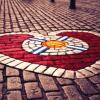
Phil Dunphy Posted April 19, 2015 Share Posted April 19, 2015 Has been a really nice touch this season, but I'm looking forward to using this beauty again; Is there anything in this world more beautiful than this image? I doubt it. Link to comment Share on other sites More sharing options...
Jambos_1874 Posted April 19, 2015 Share Posted April 19, 2015 The best crest in world football. Steeped in history, representative of an Edinburgh institution and always give me a sense of pride when I see it plus it seems to strike fear into the heart of every Hibee who sees it. One worrying thing is that I saw an article in the Scotsman yesterday which suggested it might be illegal (or words to that effect) because it has a saltire and letters within the crest. Link to comment Share on other sites More sharing options...
Cade Posted April 19, 2015 Share Posted April 19, 2015 That law is for shield-shaped badges. If there is lettering inside the shield then it counts a heraldic crest and needs to be vetted by some royal goon. As usual with these kind of things, it's a law several hundred years old and has no place in the modern world. As our crest is not a shield, we'll be fine. It's the outline of the original cobblestone heart of midlothian and not a shield. Link to comment Share on other sites More sharing options...
Weebroon98 Posted April 19, 2015 Share Posted April 19, 2015 I still prefer the old badge before the pieman changed it Link to comment Share on other sites More sharing options...
Jambos_1874 Posted April 19, 2015 Share Posted April 19, 2015 That law is for shield-shaped badges. If there is lettering inside the shield then it counts a heraldic crest and needs to be vetted by some royal goon. As usual with these kind of things, it's a law several hundred years old and has no place in the modern world. As our crest is not a shield, we'll be fine. It's the outline of the original cobblestone heart of midlothian and not a shield. I hope you're right but based on the brief bit of text within that article relating to our badge it did seem to suggest we may be in a bit of trouble. It's probably nothing but I was a bit surprised when I saw it. Link to comment Share on other sites More sharing options...
Guest oldcastlerock2012 Posted April 19, 2015 Share Posted April 19, 2015 It's the greatest badge in world football for the best named club in world football. Link to comment Share on other sites More sharing options...
Guest oldcastlerock2012 Posted April 19, 2015 Share Posted April 19, 2015 I hope you're right but based on the brief bit of text within that article relating to our badge it did seem to suggest we may be in a bit of trouble. It's probably nothing but I was a bit surprised when I saw it. The other poster is right - our badge is a heart shape not a shield so doesn't need to worry about all that heraldry stuff. Link to comment Share on other sites More sharing options...
Big Slim Stylee Posted April 19, 2015 Share Posted April 19, 2015 Is there anything in this world more beautiful than this image? I doubt it. It's undeniably fine but it's not exactly The Sistine Chapel , tbh:) Link to comment Share on other sites More sharing options...
droid Posted April 19, 2015 Share Posted April 19, 2015 I still prefer the old badge before the pieman changed it In agreement with you. Asthetically what's the line under the 1874 all about and it's basically a simplified version of what was once a great crest. Imo of course. Link to comment Share on other sites More sharing options...
tian447 Posted April 19, 2015 Share Posted April 19, 2015 I'd love us to run a 3rd kit that keeps the badge we've had for this season. It's really is great! Link to comment Share on other sites More sharing options...
kingantti1874 Posted April 20, 2015 Share Posted April 20, 2015 I'd love us to run a 3rd kit that keeps the badge we've had for this season. It's really is great! We've had loads of nice badges through the years, likewise I think they should make an occasional appearance on away kits Link to comment Share on other sites More sharing options...
Durham Jambo Posted April 20, 2015 Share Posted April 20, 2015 I was a bit dubious about this year's badge before the start of the season however I think it's sat perfectly with the way the season has gone. A classic badge for a classic season. Im looking forward to next season where we belong with our traditional badge though. Link to comment Share on other sites More sharing options...
Boof Posted April 20, 2015 Share Posted April 20, 2015 In agreement with you. Asthetically what's the line under the 1874 all about and it's basically a simplified version of what was once a great crest. Imo of course. And the dot between the H M Prefer the previous wan. Link to comment Share on other sites More sharing options...
Mollo Posted April 20, 2015 Share Posted April 20, 2015 Loved this terms badge, but I didn't like having two crests. Should have been on the away shirt also. On that basis, IMO, next term we should revert to the usual crest on all 3 strips. Link to comment Share on other sites More sharing options...
jambo_nick Posted April 20, 2015 Share Posted April 20, 2015 The best crest in world football. Steeped in history, representative of an Edinburgh institution and always give me a sense of pride when I see it plus it seems to strike fear into the heart of every Hibee who sees it. One worrying thing is that I saw an article in the Scotsman yesterday which suggested it might be illegal (or words to that effect) because it has a saltire and letters within the crest. Don't encourage the goons on nearly.net Link to comment Share on other sites More sharing options...
Jambof3tornado Posted April 20, 2015 Share Posted April 20, 2015 The other poster is right - our badge is a heart shape not a shield so doesn't need to worry about all that heraldry stuff.Sorry but you are wrong. The badge doesnt have to be a shield shape to fall under the heraldic rules and guidelines. But I do think its a nonsense about nothing given that so many clubs would be impacted. Its a none story. Link to comment Share on other sites More sharing options...
PsychocAndy Posted April 20, 2015 Share Posted April 20, 2015 I hope you're right but based on the brief bit of text within that article relating to our badge it did seem to suggest we may be in a bit of trouble. It's probably nothing but I was a bit surprised when I saw it.Our crest is a Heart. I think ithas something to do with the name of the club[emoji12] sent by my phone using an enhanced Stephen Hawking like voice Link to comment Share on other sites More sharing options...
Jambof3tornado Posted April 20, 2015 Share Posted April 20, 2015 Our crest is a Heart. I think ithas something to do with the name of the club[emoji12] sent by my phone using an enhanced Stephen Hawking like voice The shield does not have to be shield shaped. Link to comment Share on other sites More sharing options...
Francis Albert Posted April 20, 2015 Share Posted April 20, 2015 In agreement with you. Asthetically what's the line under the 1874 all about and it's basically a simplified version of what was once a great crest. Imo of course. Aesthetically what was the mock gothic lettering in the old crest all about? The new one is much smarter and looks particularly good in badge form - as in the standard avatar here. Link to comment Share on other sites More sharing options...
Thomaso Posted April 20, 2015 Share Posted April 20, 2015 Sorry but you are wrong. The badge doesnt have to be a shield shape to fall under the heraldic rules and guidelines. But I do think its a nonsense about nothing given that so many clubs would be impacted. Its a none story. The crest is based on a depiction of the Heart of Midlothian pavement mosaic in the Royal mile and therefore does not come under 'heraldic' guidelines. Link to comment Share on other sites More sharing options...
Jambof3tornado Posted April 20, 2015 Share Posted April 20, 2015 The crest is based on a depiction of the Heart of Midlothian pavement mosaic in the Royal mile and therefore does not come under 'heraldic' guidelines.Good. But I wasnt stating it did simply that a shield doesn't need to be shaped like a shield. Link to comment Share on other sites More sharing options...
Phil Dunphy Posted April 20, 2015 Author Share Posted April 20, 2015 If you don't love that badge, you're a Hibs goon. Fact. Link to comment Share on other sites More sharing options...
Unknown user Posted April 20, 2015 Share Posted April 20, 2015 Aesthetically what was the mock gothic lettering in the old crest all about? The new one is much smarter and looks particularly good in badge form - as in the standard avatar here. Not sure but that style of lettering was used the very first time we had lettering on our kits, this is from 1876-77 Link to comment Share on other sites More sharing options...
john brownlee Posted April 20, 2015 Share Posted April 20, 2015 The crest is based on a depiction of the Heart of Midlothian pavement mosaic in the Royal mile and therefore does not come under 'heraldic' guidelines.That's the only thing that could be a problem if the cooncil have copy right on the cobblestone design, but that may have run out as the design has been used for many years and there's been no objection or claim from the cooncil but it was the old Edinburgh corporation that originally designed and built itBtw it is not a shield but a street design from someone's imagination anybody can use a heart shaped design with a blue cross on it without infringing any copyright Sent from my iPad using Tapatalk Link to comment Share on other sites More sharing options...
Tasavallan Posted April 20, 2015 Share Posted April 20, 2015 That law is for shield-shaped badges. If there is lettering inside the shield then it counts a heraldic crest and needs to be vetted by some royal goon. As usual with these kind of things, it's a law several hundred years old and has no place in the modern world. As our crest is not a shield, we'll be fine. It's the outline of the original cobblestone heart of midlothian and not a shield. Correct the Hearts' badge is 'heart' shaped not 'shield' shaped. According to the Lord Lyon's office in respect to Coat of Arms: http://www.lyon-court.com/lordlyon/228.html As to the OP. I must admit that I have become accustomed to the Pieman's design rather than with the previous Gothic lettering. Link to comment Share on other sites More sharing options...
RudiHMFC Posted April 20, 2015 Share Posted April 20, 2015 The crest is based on a depiction of the Heart of Midlothian pavement mosaic in the Royal mile and therefore does not come under 'heraldic' guidelines. They can **** off with their heraldic guidelines anyway, never heard such pish in my life. Link to comment Share on other sites More sharing options...
Thomaso Posted April 20, 2015 Share Posted April 20, 2015 Not sure but that style of lettering was used the very first time we had lettering on our kits, this is from 1876-77 The lettering was "Old English" typeface Link to comment Share on other sites More sharing options...
Armageddon Posted April 20, 2015 Share Posted April 20, 2015 Has been a really nice touch this season, but I'm looking forward to using this beauty again; Is there anything in this world more beautiful than this image? I doubt it. I actually prefer the Pieman badge out of them all. Link to comment Share on other sites More sharing options...
Northwich Jambo Posted April 20, 2015 Share Posted April 20, 2015 It,s a thing of beauty, compare it to the creme egg// toblerone effort the h1b5 had a few years back...!! Link to comment Share on other sites More sharing options...
robroy1874 Posted April 20, 2015 Share Posted April 20, 2015 Truly iconic and classy crest !!! Link to comment Share on other sites More sharing options...
martoon Posted April 20, 2015 Share Posted April 20, 2015 It's undeniably fine but it's not exactly The Sistine Chapel , tbh:) Aye, but that Micky Angelo bloke did his best. Link to comment Share on other sites More sharing options...
vintage1874 Posted April 20, 2015 Share Posted April 20, 2015 I have always liked the badge we had before the pie man, used to spend hours trying to prefect the lettering as a kid. The one from his era has grown on me over the years. I would have been fine with this seasons badge for the period of ww1, but can understand why people would want the normal badge back. I'd like us to use this seasons badge in some form for the the remainder of 2014-2018 perhaps on our away shirt. Link to comment Share on other sites More sharing options...
Jambof3tornado Posted April 20, 2015 Share Posted April 20, 2015 Correct the Hearts' badge is 'heart' shaped not 'shield' shaped. According to the Lord Lyon's office in respect to Coat of Arms: http://www.lyon-court.com/lordlyon/228.html As to the OP. I must admit that I have become accustomed to the Pieman's design rather than with the previous Gothic lettering. The office also confirmed a shield is not restricted to being shield shaped, therefore just because our badge is heart shaped it does not rule us out. Still say its not going to be an issue though. Much ado about nothing. Link to comment Share on other sites More sharing options...
Thomaso Posted April 20, 2015 Share Posted April 20, 2015 The office also confirmed a shield is not restricted to being shield shaped, therefore just because our badge is heart shaped it does not rule us out. Still say its not going to be an issue though. Much ado about nothing. It is not intended to be a "shield". It is a representation of the design of the Heart of Midlothian mosaic in the Royal Mile. Not a Lord Lyon matter, although as someone pointed out Edinburgh Council might have something to say on copyright (shhhh....don't mention that to the Bitters!) Link to comment Share on other sites More sharing options...
Unknown user Posted April 20, 2015 Share Posted April 20, 2015 It is not intended to be a "shield". It is a representation of the design of the Heart of Midlothian mosaic in the Royal Mile. Not a Lord Lyon matter, although as someone pointed out Edinburgh Council might have something to say on copyright (shhhh....don't mention that to the Bitters!) I reckon we'll be alright unless the council install a wee © cobble next to it Link to comment Share on other sites More sharing options...
3fingersreid Posted April 20, 2015 Share Posted April 20, 2015 I've always liked the old round badge we used to have above the tunnel This seasons badge was a fitting tribute tho Link to comment Share on other sites More sharing options...
Buffalo Bill Posted April 20, 2015 Share Posted April 20, 2015 Has been a really nice touch this season, but I'm looking forward to using this beauty again; Is there anything in this world more beautiful than this image? I doubt it. Spot on. It's the best crest in football bar none. Link to comment Share on other sites More sharing options...
luckyBatistuta Posted April 21, 2015 Share Posted April 21, 2015 Has been a really nice touch this season, but I'm looking forward to using this beauty again; Is there anything in this world more beautiful than this image? I doubt it. Got to type this quick the wife is coming in...No sir, there is not. Link to comment Share on other sites More sharing options...
jbee647 Posted April 21, 2015 Share Posted April 21, 2015 The badge with the gothic design, the fore runner for the present version was created for the 1958 tour of Canada and USA and worn on the club blazers, and was only worn on the kit for the the first time in 1977 after we got relegated and appeared on the original umbro "diamonds " strip. Link to comment Share on other sites More sharing options...
Unknown user Posted April 21, 2015 Share Posted April 21, 2015 Best one I could find from a quick search, shame about the bricks Link to comment Share on other sites More sharing options...
NRJ1966 Posted April 21, 2015 Share Posted April 21, 2015 Still have a patch of this off an old pair of shortsAlways wondered what the "spiky burger roll" / sputnik is in the middle is...anyone know what that is meant to represent?I know in the new one it is a representation of a football Link to comment Share on other sites More sharing options...
Unknown user Posted April 21, 2015 Share Posted April 21, 2015 Still have a patch of this off an old pair of shorts Always wondered what the "spiky burger roll" / sputnik is in the middle is...anyone know what that is meant to represent? I know in the new one it is a representation of a football It's a representation of a football isn't it? Link to comment Share on other sites More sharing options...
NRJ1966 Posted April 21, 2015 Share Posted April 21, 2015 It's a representation of a football isn't it? Could be Smithee, the old style panels and lacing.....I can kind of see that....it does look a bit like a 3 year old (or Picasso) has drawn it though It would make sense it being a football since it is the badge of a football team!! :smiley2: Link to comment Share on other sites More sharing options...
Unknown user Posted April 21, 2015 Share Posted April 21, 2015 Could be Smithee, the old style panels and lacing.....I can kind of see that....it does look a bit like a 3 year old (or Picasso) has drawn it though It would make sense it being a football since it is the badge of a football team!! :smiley2: I vaguely remember older versions were even more difficult to make out! It's pretty interesting to see the difference in colours as well, I wonder if the badge will be updated to reflect our official maroon tone? Link to comment Share on other sites More sharing options...
NRJ1966 Posted April 21, 2015 Share Posted April 21, 2015 Yep sometimes it just looks like a squiggle, a sun or an equals sign!!I know the old one I have is pretty much the same background colour as the shirt of the time, late 80s/early 90s maybe, so a wee bit lighter than the official maroon now.I always thought the Robinson one was far too red ( and a bit squashed out the way) when it was introduced but when you actually see it on a shirt it looks darker and better Link to comment Share on other sites More sharing options...
Walrus Posted April 21, 2015 Share Posted April 21, 2015 Best one I could find from a quick search, shame about the bricks Link to comment Share on other sites More sharing options...
Hearts007 Posted April 21, 2015 Share Posted April 21, 2015 Has been a really nice touch this season, but I'm looking forward to using this beauty again; Is there anything in this world more beautiful than this image? I doubt it. no there isn't,sheer class just my Opinion though Link to comment Share on other sites More sharing options...
The Treasurer Posted April 21, 2015 Share Posted April 21, 2015 I think we will all be glad to see our "real" crest back on the shirts for next season. But, given the reason for this season's change, I think it's quite appropriate that this seasons one will be forever associated with our Championship winning side. Link to comment Share on other sites More sharing options...
martoon Posted April 21, 2015 Share Posted April 21, 2015 Still have a patch of this off an old pair of shorts Always wondered what the "spiky burger roll" / sputnik is in the middle is...anyone know what that is meant to represent? I know in the new one it is a representation of a football It's a well in the middle. The decreasing size of the brickwork indicates gradual depth and the centre is the pulling mechanism that is above the well. Stand to be corrected but that's what my dad told me in the seventies. Link to comment Share on other sites More sharing options...
Unknown user Posted April 21, 2015 Share Posted April 21, 2015 It's a well in the middle. The decreasing size of the brickwork indicates gradual depth and the centre is the pulling mechanism that is above the well. Stand to be corrected but that's what my dad told me in the seventies. Pretty sure it's a football, one of the things they talked about when designing the new version was making the football actually look like a football. I liked the spiky burger call though Link to comment Share on other sites More sharing options...


 64,116
Recommended Posts
Archived
This topic is now archived and is closed to further replies.