Sten Guns Posted January 19, 2015 Share Posted January 19, 2015 Pitch looks narrower. Probably isn't though. Link to comment Share on other sites More sharing options...
Rudolf's Mate Posted January 19, 2015 Share Posted January 19, 2015 Think it's based on the carpet they roll out at the Oscars [emoji2] Sent from my iPad using Tapatalk Link to comment Share on other sites More sharing options...
Jambof3tornado Posted January 19, 2015 Share Posted January 19, 2015 Correct me if I am wrong but I don't think we commissioned this to be hearts maroon, was it not just that the supplier had this colour as part of its book?Pretty much, yes. Looks lovely to me. Link to comment Share on other sites More sharing options...
Ray Gin Posted January 19, 2015 Share Posted January 19, 2015 Pitch looks narrower. Probably isn't though. Definitely is when you watch right to the end of the clip. The pitch is wider on the other half of the pitch when the camera pans round. Presumably they still had to relay a strip when that was filmed. Link to comment Share on other sites More sharing options...
hhjambo Posted January 19, 2015 Share Posted January 19, 2015 This season's strip colour should be our official maroon. That track looks a lot lighter than I'd hoped. Hopefully it's a lot darker than it looks in the video Link to comment Share on other sites More sharing options...
Five to One Posted January 19, 2015 Share Posted January 19, 2015 Should have just gone with green in my opinion. Blends in better. Unless the new track is going to have insignia or advertising on it, it looks a bit garish. Sent from my iPhone using Tapatalk Link to comment Share on other sites More sharing options...
Gorgie_Rules Posted January 20, 2015 Share Posted January 20, 2015 Correct me if I am wrong but I don't think we commissioned this to be hearts maroon, was it not just that the supplier had this colour as part of its book? Think thats pretty much it, as close to our maroon as we could get. Think it looks good from the video, could have also looked good or more modern/Europeanish if was black. Hope a paint job for the flood lights is up next Link to comment Share on other sites More sharing options...
Craigieboy Posted January 20, 2015 Share Posted January 20, 2015 Should have just gone with green in my opinion. Blends in better. Unless the new track is going to have insignia or advertising on it, it looks a bit garish. Sent from my iPhone using Tapatalk Link to comment Share on other sites More sharing options...
alanbauld Posted January 20, 2015 Share Posted January 20, 2015 As anyone who has ever had a red car knows red turns pink if left in the sun so it might not be pink at the moment but give it time. My main worry is pink might make the Hibbies feel more at home when they visit. Link to comment Share on other sites More sharing options...
Dagger Is Back Posted January 20, 2015 Share Posted January 20, 2015 Good news that we've replaced the track which was much the worse for wear. Another wee thing ticked off the health and safety risk assessment. Link to comment Share on other sites More sharing options...
bigis semiauskas Posted January 20, 2015 Share Posted January 20, 2015 Panic over guys, just had a look from roseburn. Dark in colour don't listen to the pink panic merchants Sent from my iPhone using Tapatalk Link to comment Share on other sites More sharing options...
Fort Vallance Posted January 20, 2015 Share Posted January 20, 2015 As anyone who has ever had a red car knows red turns pink if left in the sun so it might not be pink at the moment but give it time. My main worry is pink might make the Hibbies feel more at home when they visit. Reflection from the bus shelter apparently. Link to comment Share on other sites More sharing options...
I.T.K Posted January 20, 2015 Share Posted January 20, 2015 As anyone who has ever had a red car knows red turns pink if left in the sun so it might not be pink at the moment but give it time. My main worry is pink might make the Hibbies feel more at home when they visit. Maybe cars that were 20 years old and french. The world of paint has moved on since then. Link to comment Share on other sites More sharing options...
alanbauld Posted January 20, 2015 Share Posted January 20, 2015 Maybe cars that were 20 years old and french. The world of paint has moved on since then. Ford Capris so maybe they were a while back, still see a few faded red cars around though. Link to comment Share on other sites More sharing options...
scott_jambo Posted January 20, 2015 Share Posted January 20, 2015 Next thing we'll be playing on green grass Craigieboy. How will you cope? Link to comment Share on other sites More sharing options...
CreativeCat Posted January 20, 2015 Share Posted January 20, 2015 Bit tacky, but at the end of the day it's just a bit of astro Link to comment Share on other sites More sharing options...
Craigieboy Posted January 20, 2015 Share Posted January 20, 2015 Next thing we'll be playing on green grass Craigieboy. How will you cope? Come on. To suggest green track is just ridiculous. Loads of clubs have their teams colours round the track. Getting green would be stupid. Link to comment Share on other sites More sharing options...
scott_jambo Posted January 20, 2015 Share Posted January 20, 2015 Come on. To suggest green track is just ridiculous. Loads of clubs have their teams colours round the track. Getting green would be stupid. Green artificial grass. Mindblowing stuff. Link to comment Share on other sites More sharing options...
Guest Bilel Mohsni Posted January 20, 2015 Share Posted January 20, 2015 Nice to see the place tarted up a wee bit. Link to comment Share on other sites More sharing options...
Craigieboy Posted January 20, 2015 Share Posted January 20, 2015 tarted up. Link to comment Share on other sites More sharing options...
bigis semiauskas Posted January 20, 2015 Share Posted January 20, 2015 Its not a car thou..artificial grass doesn't fade Sent from my iPhone using Tapatalk Link to comment Share on other sites More sharing options...
Swanston JT Posted January 20, 2015 Share Posted January 20, 2015 Ann Budge stated at the recent AGM that an order had been placed for a maroon synthetic track. it would have been down quicker if Green had been ordered, worth the wait for Maroon in my opinion. She also stated that contact had been made with Deluxe paints to get as close a match as possible to the "Hearts maroon" as possible, and when this has been achieved, painting at the stadium will start. All good news coming out these days. Link to comment Share on other sites More sharing options...
Guest Bilel Mohsni Posted January 20, 2015 Share Posted January 20, 2015 Ann Budge stated at the recent AGM that an order had been placed for a maroon synthetic track. it would have been down quicker if Green had been ordered, worth the wait for Maroon in my opinion. She also stated that contact had been made with Deluxe paints to get as close a match as possible to the "Hearts maroon" as possible, and when this has been achieved, painting at the stadium will start. All good news coming out these days. Someone will still moan about the maroon used on the seats! Too bloody burgundy! Link to comment Share on other sites More sharing options...
Jarhead Posted January 20, 2015 Share Posted January 20, 2015 Ann Budge stated at the recent AGM that an order had been placed for a maroon synthetic track. it would have been down quicker if Green had been ordered, worth the wait for Maroon in my opinion. She also stated that contact had been made with Deluxe paints to get as close a match as possible to the "Hearts maroon" as possible, and when this has been achieved, painting at the stadium will start. All good news coming out these days. What's up with using your first post to say something factually correct?I thought it was common practice to make something up then repeat it ad nauseum. :-) I think the new track will look great. Link to comment Share on other sites More sharing options...
Francis Albert Posted January 20, 2015 Share Posted January 20, 2015 Ann Budge stated at the recent AGM that an order had been placed for a maroon synthetic track. it would have been down quicker if Green had been ordered, worth the wait for Maroon in my opinion. She also stated that contact had been made with Deluxe paints to get as close a match as possible to the "Hearts maroon" as possible, and when this has been achieved, painting at the stadium will start. All good news coming out these days.I'll be interested to see what "painting the stadium" means. I hope it doesn't mean that the roof and floodlight supports are painted maroon (in any shade!). The combination of white steelwork or pink steelwork (which I actually prefer - it's different and lively) and largely maroon seats works really well, Maroon steelwork and inevitably mismatching maroon seats (see the pictures of the new synthetic track) would be horrible. Link to comment Share on other sites More sharing options...
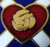
Neil Jung Posted January 20, 2015 Share Posted January 20, 2015 I'll be interested to see what "painting the stadium" means. I hope it doesn't mean that the roof and floodlight supports are painted maroon (in any shade!). The combination of white steelwork or pink steelwork (which I actually prefer - it's different and lively) and largely maroon seats works really well, Maroon steelwork and inevitably mismatching maroon seats (see the pictures of the new synthetic track) would be horrible.Ditch the pink, get full maroon seating with a massive HMFC (white letters, black shadow) on the Wheatfield, ditch the badges which are poorly done. I feel strongly about this. Link to comment Share on other sites More sharing options...
Different Class Posted January 20, 2015 Share Posted January 20, 2015 Ditch the pink, get full maroon seating with a massive HMFC (white letters, black shadow) on the Wheatfield, ditch the badges which are poorly done. I feel strongly about this. Nah. The badges look good and are a bit different. HMFC wouldn't even be centred given the number of sections.. Link to comment Share on other sites More sharing options...
Guest Bilel Mohsni Posted January 20, 2015 Share Posted January 20, 2015 Badges for me every time. Generic shadowed writing is ten-a-penny pish. Link to comment Share on other sites More sharing options...
Francis Albert Posted January 20, 2015 Share Posted January 20, 2015 Ditch the pink, get full maroon seating with a massive HMFC (white letters, black shadow) on the Wheatfield, ditch the badges which are poorly done. I feel strongly about this.The badges are superb. Wholly distinctive and shear class. Shadow writing? White with black shadows? Jeez! Link to comment Share on other sites More sharing options...
Neil Jung Posted January 20, 2015 Share Posted January 20, 2015 Badges for me every time. Generic shadowed writing is ten-a-penny pish. If you like badges at least do it right. Ours are thin lines with no depth. Look at Anfield as an example for classy writing (I can't add a pic but would appreciate if someone else could). The alignment would need addressed but you could do it over BCDE with something on F? Adidas or other sponsor badge. It would look immense. Link to comment Share on other sites More sharing options...
Neil Jung Posted January 20, 2015 Share Posted January 20, 2015 The badges are superb. Wholly distinctive and shear class. Shadow writing? White with black shadows? Jeez!To be fair you think pink steel is the business. When you look at greens and reds do you see grey? Seriously look at the seating in Anfield and tell me it's poor. Link to comment Share on other sites More sharing options...
Guest Bilel Mohsni Posted January 20, 2015 Share Posted January 20, 2015 If you like badges at least do it right. Ours are thin lines with no depth. Look at Anfield as an example for classy writing (I can't add a pic but would appreciate if someone else could). The alignment would need addressed but you could do it over BCDE with something on F? Adidas or other sponsor badge. It would look immense. Only ever noticed the "L.F.C" design, never seen their badge on the seats. I think their L.F.C design looks generic and completely forgettable. Our badges are a great wee design, and the best possible with so few seats available to make an image. If Liverpool only have the lettering, then I'd choose our design every time, tbh. Link to comment Share on other sites More sharing options...
Guest Bilel Mohsni Posted January 20, 2015 Share Posted January 20, 2015 Seriously? This?? http://www.cuju8.com/images/liverpool.jpg Link to comment Share on other sites More sharing options...
Francis Albert Posted January 20, 2015 Share Posted January 20, 2015 To be fair you think pink steel is the business. When you look at greens and reds do you see grey? Seriously look at the seating in Anfield and tell me it's poor.Googling images of Anfield shows me what I remember from being there. A very unimaginative use of the letters L F C. It's poor. As in Charlie's link. I mean really? Link to comment Share on other sites More sharing options...
Neil Jung Posted January 20, 2015 Share Posted January 20, 2015 Only ever noticed the "L.F.C" design, never seen their badge on the seats. I think their L.F.C design looks generic and completely forgettable. Our badges are a great wee design, and the best possible with so few seats available to make an image. If Liverpool only have the lettering, then I'd choose our design every time, tbh.You may be right about the smaller number of seats but I've always thought the badges were poor and a bit gimmicky. Thin lines, etc. I've always thought Ibrox looked good with nothing on the seats, I wouldn't object to that either. Sometimes 'traditional' is best. Link to comment Share on other sites More sharing options...
Neil Jung Posted January 20, 2015 Share Posted January 20, 2015 Seriously? This?? http://www.cuju8.com/images/liverpool.jpg Absolutely. Great balance between good, solid lettering and the team colour. Perfect. Link to comment Share on other sites More sharing options...
CreativeCat Posted January 20, 2015 Share Posted January 20, 2015 Disagree. Ethiad had nothing on the seats when I was down and it just really lacks something. Link to comment Share on other sites More sharing options...
Guest Bilel Mohsni Posted January 20, 2015 Share Posted January 20, 2015 You may be right about the smaller number of seats but I've always thought the badges were poor and a bit gimmicky. Thin lines, etc. I've always thought Ibrox looked good with nothing on the seats, I wouldn't object to that either. Sometimes 'traditional' is best. Chalk and cheese, us two NJ. I think ours looks great, unique and appropriate. Liverpool's, just meh, no problem with it, just really generic and uninteresting. No design, is fine, but not a patch on having our unique badge on our unique stadium, imo. Link to comment Share on other sites More sharing options...
Neil Jung Posted January 20, 2015 Share Posted January 20, 2015 Disagree. Ethiad had nothing on the seats when I was down and it just really lacks something. There's a balance. If you want something on the seats do it properly. Link to comment Share on other sites More sharing options...
Neil Jung Posted January 20, 2015 Share Posted January 20, 2015 Googling images of Anfield shows me what I remember from being there. A very unimaginative use of the letters L F C. It's poor. As in Charlie's link. I mean really?LFC are the club's initials and a symbol the world recognises. It may be unimaginative to you but what would you prefer in a footie stadium? Remember when the club badge was rolled into the pitch. Did you like that? I hated it. Link to comment Share on other sites More sharing options...
CreativeCat Posted January 20, 2015 Share Posted January 20, 2015 There's a balance. If you want something on the seats do it properly.Would selling advertising space to a sponsor be an option? I probably wouldn't mind having Adidas painted on the seats somewhere. They'd probably want the main stand considering the TV view and that's not really possible. I quite like the badges. Used to think I was top dog when I had a seat right in the middle of one on the yellow Link to comment Share on other sites More sharing options...
Neil Jung Posted January 20, 2015 Share Posted January 20, 2015 Chalk and cheese, us two NJ. I think ours looks great, unique and appropriate. Liverpool's, just meh, no problem with it, just really generic and uninteresting. No design, is fine, but not a patch on having our unique badge on our unique stadium, imo. Another example of terrible wording on seats would be St Johnstone in skinny lettering. Link to comment Share on other sites More sharing options...
Guest Bilel Mohsni Posted January 20, 2015 Share Posted January 20, 2015 Another example of terrible wording on seats would be St Johnstone in skinny lettering. It has to be skinny lettering, there's not enough seats for anything else. Our badges are arty and unique, imo. Link to comment Share on other sites More sharing options...
bigis semiauskas Posted January 20, 2015 Share Posted January 20, 2015 Still a badge short from when first built, just plain seating put in its place. Sent from my iPhone using Tapatalk Link to comment Share on other sites More sharing options...
Neil Jung Posted January 20, 2015 Share Posted January 20, 2015 It has to be skinny lettering, there's not enough seats for anything else. Our badges are arty and unique, imo. Then why have lettering in the first place? Some clubs obviously feel the need to remind the fans of which ground they've come to at the expense of stadium aesthetics! Link to comment Share on other sites More sharing options...
Guest Bilel Mohsni Posted January 20, 2015 Share Posted January 20, 2015 Then why have lettering in the first place? Some clubs obviously feel the need to remind the fans of which ground they've come to at the expense of stadium aesthetics! You'd need to ask St Johnstone. Or Livingston etc. Ours however is our iconic brand and not just some unimaginative letter branding. Have to say though, I really don't see what is so amazing about Anfields lettering... just pointless and a bit dull. Link to comment Share on other sites More sharing options...
Neil Jung Posted January 20, 2015 Share Posted January 20, 2015 You'd need to ask St Johnstone. Or Livingston etc. Ours however is our iconic brand and not just some unimaginative letter branding. Have to say though, I really don't see what is so amazing about Anfields lettering... just pointless and a bit dull. For the same reason that the best strips are the simplest designs and not necessarily the most imaginative. Link to comment Share on other sites More sharing options...
Francis Albert Posted January 20, 2015 Share Posted January 20, 2015 LFC are the club's initials and a symbol the world recognises. It may be unimaginative to you but what would you prefer in a footie stadium? Remember when the club badge was rolled into the pitch. Did you like that? I hated it. I'd prefer something a wee bit more imaginative than "LFC" or "HMFC". Which thankfully we have. And no I don't want the badge rolled onto the pitch. But then it isn't, is it? Link to comment Share on other sites More sharing options...
Guest Bilel Mohsni Posted January 20, 2015 Share Posted January 20, 2015 For the same reason that the best strips are the simplest designs and not necessarily the most imaginative. Looks like a shan graffiti tagging on the back of a rugby club wall imo. Link to comment Share on other sites More sharing options...
Francis Albert Posted January 20, 2015 Share Posted January 20, 2015 Then why have lettering in the first place? Some clubs obviously feel the need to remind the fans of which ground they've come to at the expense of stadium aesthetics!And some clubs such as Hearts manage to combine reminding fans which ground they have come to with aesthetics which also appeal to those who don't need to be reminded! Link to comment Share on other sites More sharing options...


Recommended Posts
Archived
This topic is now archived and is closed to further replies.